Rohrbach classics have a new look. Again. Here's why.
Rochester's oldest craft brewery unveils its third new can design in the last 10 years.
Many people might be surprised to know that Rochester’s oldest craft brewery is also among its most forward-thinking.
In the same amount of time most breweries have had one visual identity, Rohrbach Brewing Co., founded in 1991 by John Urlaub, is rolling out its third can design in the last 10 years. (Everyone of a certain age remembers the era before cans, when you would pick up a growler of your favorite Rohrbach beer from Wegmans.)
And graphic designer Brittany Statt is the creative force behind each of Rohrbach’s eras.
While most craft breweries are content to remain the same, both visually and beer-wise, Rohrbach is taking a bit of a risk. So why is a brewery known for tradition and quality focused on reinvention and innovation? It would be easy to rely on your flagships (or as Rohrbach calls them “classics” — Scotch Ale, Highland Lager, Blueberry Ale, Vanilla Porter — and sprinkle in some IPAs and a few seasonals. But that has never been the Rohrbach way.
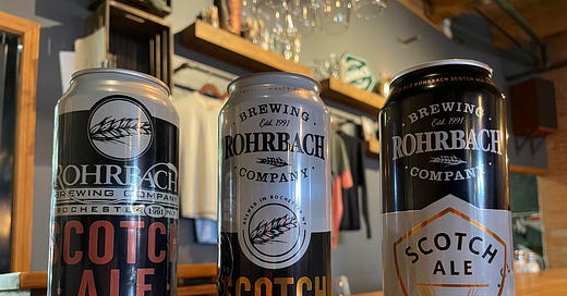
Photo: Starting in 2014, left, Rohrbach’s flagship releases have featured three distinct designs. The latest is on the right.
“We decided we wanted to freshen up the look,” Urlaub said. “We wanted to be very careful to not significantly change it. The cans had a pretty standard design across our classics, except for Space Kitty and Different Animal. Brittany embraced the challenge, saying, ‘Let’s not make major changes to colors or the overall look. But let’s freshen it up.’
“We wanted to make the look a little more modern. I think Brittany did a great job of hitting that target. I think when you see the new can on the shelf, you will still recognize it.”
New cans now?
It has never been harder to operate a craft brewery. Competition is high, shelf space is limited, consumer tastes are fickle. (Do people even like beer anymore?) By focusing on tweaks and improvements, the hope is that Rohrbach can attract new customers and maintain its faithful followers. Redesigned Scotch Ale cans have already hit the market. Vanilla Porter is next. And it’ll be followed by others as the brewery exhausts its pre-existing stock of old labels. (I really, really like the splash of lilac in the forthcoming Highland Lager label.)
“I think it pops just a little bit more,” Urlaub said. “It’s a very competitive market. And you could say it’s a pretty insignificant change, and it probably is, but I just love the look of the new can. It freshens it up. It makes it pop a little more. We hope to catch the consumer’s eye.”
Urlaub isn’t sure the move will drive sales. But it’s worth a shot. It’s a chance to reinvent and remain relevant, Urlaub concluded.
Photo: Brittany Statt. Photo by Michelle Godfrey.
Growing up
Since moving away from growlers and purchasing a canning line in 2014, this is the third new look for Rohrbach. Rohrbach was one of the first local breweries to embrace packaging in 16-ounce cans.
Statt started at Rohrbach as a marketing intern and then poured samples on Saturday mornings during the Rochester Public Market. She has designed each of the brewery’s three looks. (In that tasting room era, craft breweries weren’t even allowed to charge money for their pints. Statt said Rohrbach encouraged tip donations, which were then donated to local nonprofits. State law changed that, however.)
“When we weren’t busy, I could pull out my laptop and do our social media and design work,” Statt said.
Statt graduated from the Rochester Institute of Technology and after a brief stint at a marketing agency, she re-joined the brewery.
“I was part-time designer, part-time sales,” Statt said. She really didn’t enjoy the sales role, but said she gained a lot of insight from it. Statt then worked as the brewery’s marketing director before launching her own firm, Brittany Statt Design and Marketing, two years ago. She was also responsible for coordinating and organizing the Flour City Brewers Fest.
“I realized I really loved working with local businesses and feeling like I made a difference,” Statt said. “Wearing so many different hats, I just enjoy it so much.”
Most of her work has been focused on craft beverages and travel and hospitality, including a number of wineries in this region. Rorhbach remains her only brewery client. (But if they were smart, they would partner with her immediately. Her work goes beyond labels and extends to websites, social media, marketing, and messaging.)
“I could nerd out on this whole process for hours,” Statt joked.
A refresh
Over the last 10 years, most craft breweries in this region have remained the same. And that’s certainly a safe strategy. But as the market gets increasingly more competitive, why not try to do something, anything, to excite your core audience and also attract new fans?
For some, tradition works. For others, there is no time to rest.
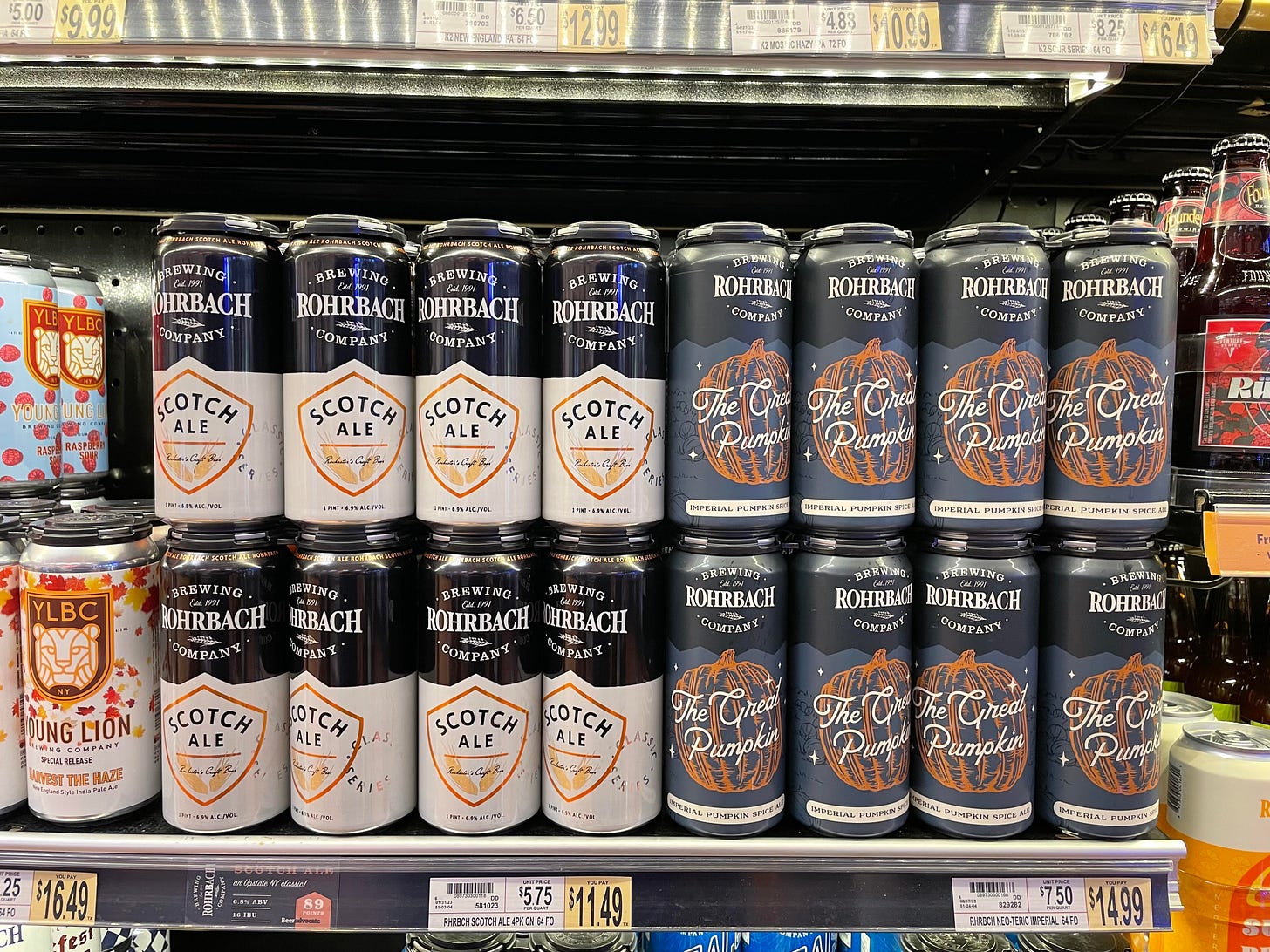
Photo: Two Rohrbach releases on the shelf at a local Wegmans store.
The Rohrbach logo or crest remains prominent on the new labels. That logo takes more of a back seat for its seasonal releases as those labels tend to be a bit more playful. Urlaub is particularly excited to unveil the new look for the Blueberry Ale. Each of the new labels features a distinctive and recognizable shield containing the beer name.
“For some breweries their look is so classic, you wouldn’t touch it,” Urlaub said.
That has never been the case for Rohrbach or for the Genesee Brewery, which has also rebranded its flagship labels in recent years.
An arduous process
It’s not as simple as just cooking up a new design and then sending it to market, Statt said. She started this process more than a year ago. Statt said Rohrbach is just big enough to order printed cans, because the manufacturer requires a minimum order. Rohrbach worked with four companies to “go from screen to can,” Statt said.
When Rohrbach made that initial move to cans, Statt had to drive down to Virginia to visit the manufacturer and make sure the cans were printed properly.
“I wasn’t even old enough to rent a car,” Statt said. “I had to have John co-sign for it.”
Statt admitted she didn’t really like the original cans she designed. When she looks at her work now, she sees evolution and growth. grown. “I was a kid,” she said. “I wasn’t very good. I was in college. It shows how much better I’ve gotten as a designer.” But when those original designs launched in 2014, they really created a visual identity for Rohrbach by striking a balance between tradition and modernity.
“I was starting from scratch with those first cans,” Statt said.
It was a blank canvas, one where she could introduce color and other design elements.
“We wanted something fresh at the time, but it also had to be timeless, dependable, and classic, especially considering the brand of Scotch Ale within the brand,” Statt said. “Going simple was a way to stand out on the shelf.”
The Space Kitty double IPA label won’t change, because “it’s already kind of its own thing,” Statt said. Different Animal, the most recent beer to join Rohrbach’s flagship family, will get a new look. That new look probably won’t see shelves for at least a year. Before new labels are released, there are multiple levels of approval needed.
Statt joked that the first designs look outdated. “It’s wild, that it happens that quickly,” she said. “It shows how the industry has moved in just 10 years.”
Urlaub wanted something subtle with each successive Rohrbach refresh, Statt said. He valued freshness and remaining recognizable, she said. The second wave of designs utilized the same fonts and followed the same path. Special attention was paid to designing a logo that could be featured on both tap handles and social media. Designing a logo is also about crafting an identity.
“Every decision is very intentional,” Statt said. Pointing to Rohrbach’s Parting Glass series of barrel-aged beers, Statt pointed out how the brewery logo isn’t on the front of the label. “It is very much branded as its own and it’s almost meant to be a little mysterious,” she added. And for its Neoteric series of seasonals and one-offs, the Rohrbach logo is about 30 percent of the size of the one featured on its classic releases. It’s very much about the novelty or playfulness of the beer.
The latest refresh, however, is more of a departure.
The process begins with research. Statt takes a survey of the market and makes note of trends. She’ll then come up with a few different options for clients to review. “It’s very collaborative,” Statt said. For past refreshes, Statt admitted she was too focused on one brand, Scotch Ale. This time, she approached it more holistically and really tried to come up with an identity that can extend to multiple beers. She mocked them all up together.
“We really took our time this time and came up with a bunch of templates,” Statt said. “The design options I gave them were from the least amount of change to the most amount of change.”
She expected subtle changes to ultimately win out. That’s not what happened.
“Everyone loved this new look,” she said. “It’s a fairly big departure. It’s noticeable. Sometimes the point with a refresh is for people not to notice.”
Urlaub is never afraid to empower his employees and partners.
“The success that Rohrbach has had, in no small way, is because of the people I’ve been fortunate enough to surround myself with,” Urlaub said. “I could go back to all the brewers we’ve worked with, those guys have always made great beer. We’ve been so lucky to have Brittany work with us.”
As Rohrbach approaches its 34th year in business, Urlaub remains motivated. He said he’s having fun every day and added that he relishes facing new challenges.
“Since the industry is changing so much, we have to change,” Urlaub said. “We can’t stay the same and continue to do what we did. For me, it’s all new and exciting, because it’s challenging. We’re not in a growth industry any more. It’s more competitive.
“It’s about just surrounding yourself with the right people. Most of the people in the industry are much younger than I am and they carry this enthusiasm about the industry. It helps to fuel the energy I have. You really can’t be complacent. Companies that have been around for a long time sometimes lose that fire.”


